All Work > UX Case Study
Custom Label Checkout Flow
From Small Orders to Bulk Needs Checkout Experience
Duration
4 weeks
Deliverables
Research, User Flow, and Wireframing
Tools
Figma
Overview
In this project, I redesigned the checkout experience for a confidential brand to simplify a complex flow and improve completion rates.
The original process had 16 steps, which created confusion and drop-offs. I reduced it to 5 clear phases, making the experience faster, more intuitive, and easier to complete especially for new users.
The Challenge
The existing checkout flow was long and overwhelming. Users had to go through too many steps, with limited guidance and unclear feedback.
This led to:
- High drop-off rates
- Confusion during key steps
- Frustration, especially for first-time users
The process
Research > Define & Ideate > Information Architecture (IA) > Wireframing
My Approach
I collaborated with cross-functional teams to identify pain points and simplify the experience.
My focus was to:
- Reduce the number of steps
- Show only what’s necessary at each stage
- Guide users with clear feedback and instructions
- Support both guest and returning users
Stage in Customer Journey
What do we want the user to do next and how do we nudge them to take action.

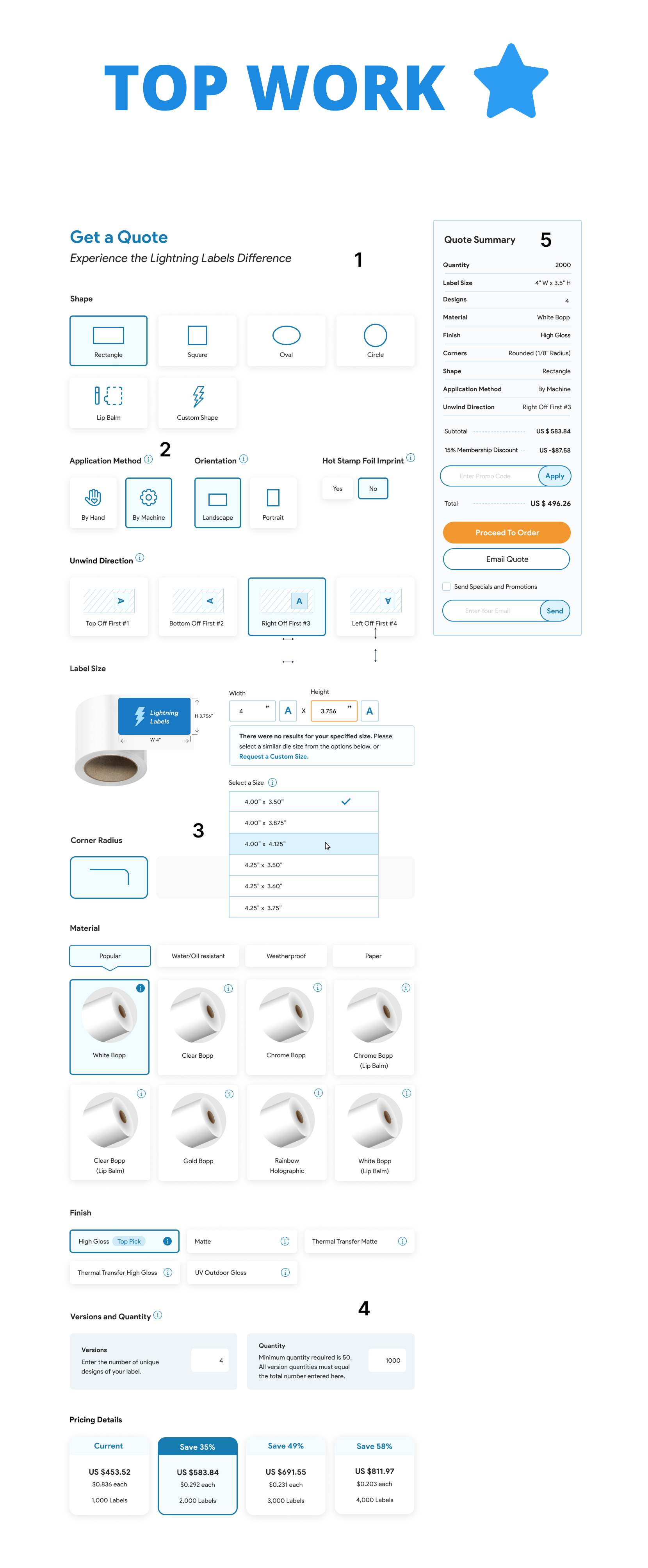
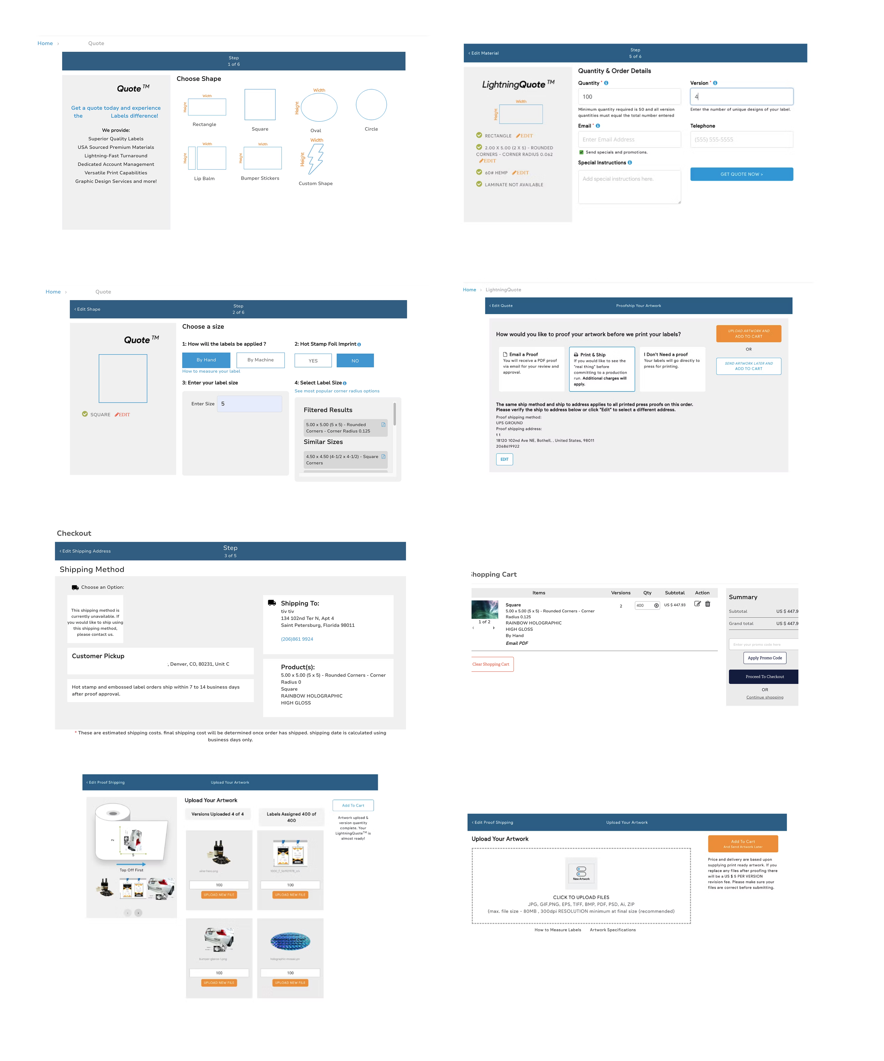
Some of the old checkout steps
Sharing some of the old designs to highlight the improvements made in the updated version.
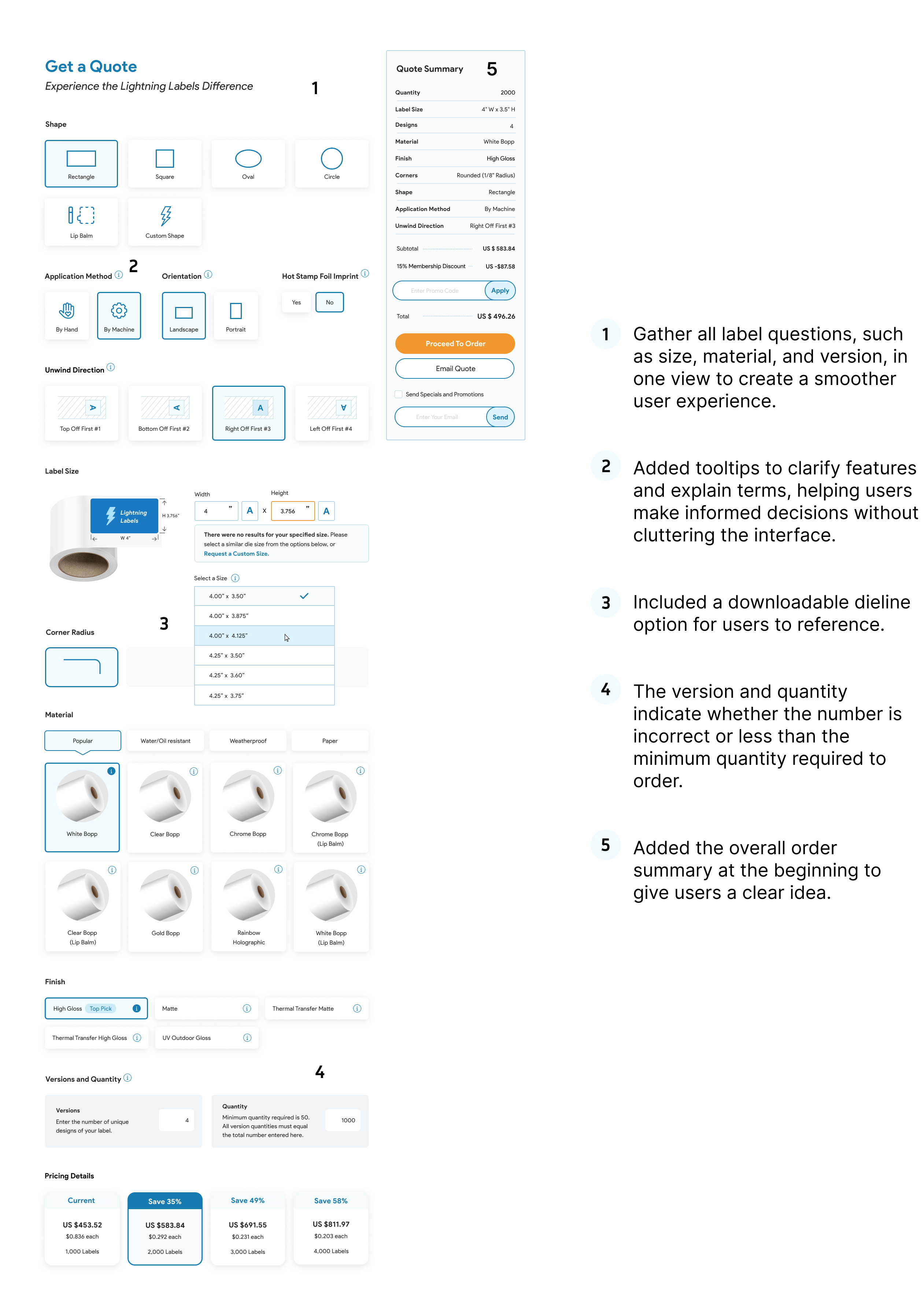
Updated Checkout Design
Key Improvements
1. Simplified Flow
I reduced the checkout from 16 steps to 5 phases, making it more structured and less overwhelming.
2. Smarter Inputs & Guidance
- Added autofill and smart suggestions to speed up form entry
- Introduced real-time error validation
- Included tooltips and helper text to explain complex fields
3. Better Product Configuration
- Consolidated label options (size, material, version) into a single view
- Added instant previews for each version
- Included a downloadable dieline for reference
4. Improved Visibility & Feedback
- Displayed order summary early in the flow
- Added progress indicators during artwork uploads
- Highlighted minimum quantity and errors clearly
5. Enhanced Cart & Review Experience
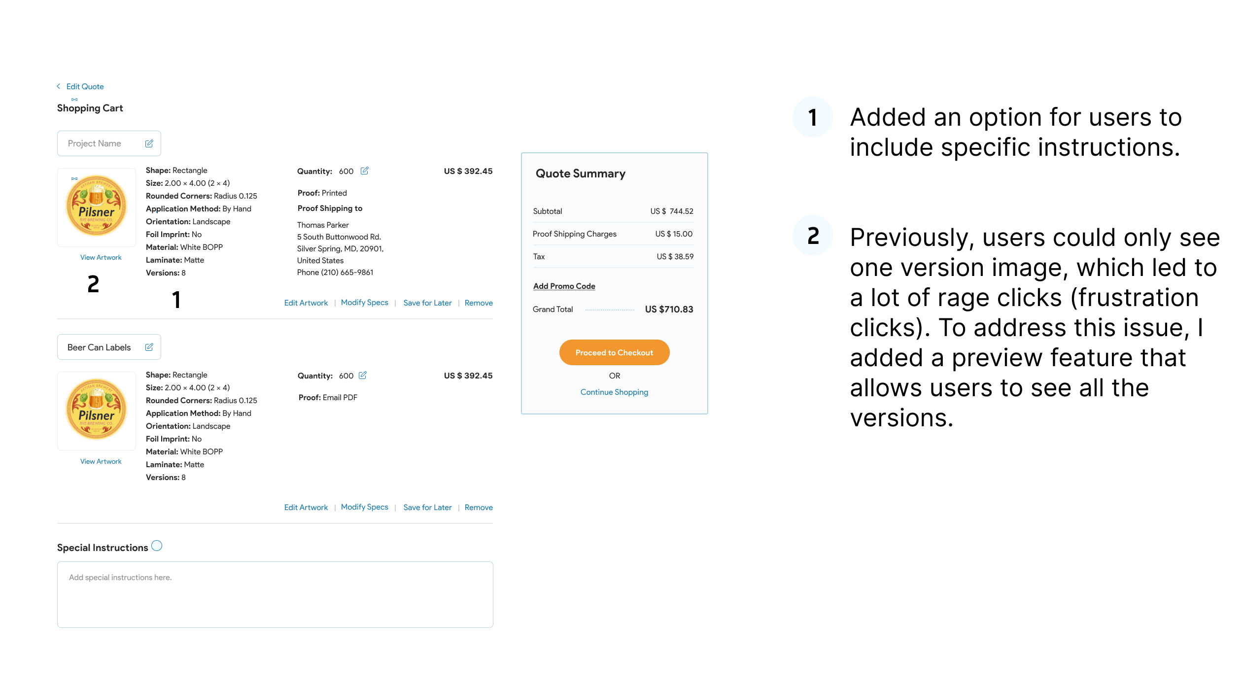
- Enabled users to add special instructions
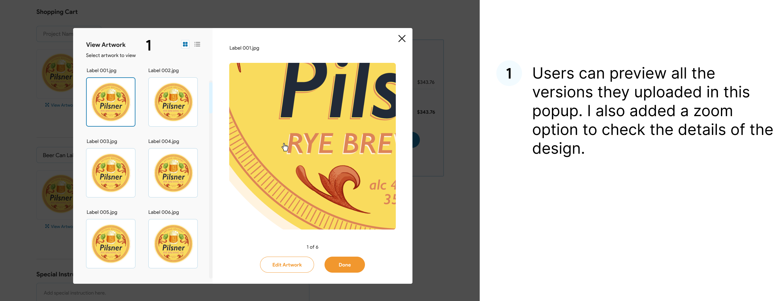
- Introduced multi-version preview to reduce frustration (rage clicks)
- Added zoom functionality for detailed review
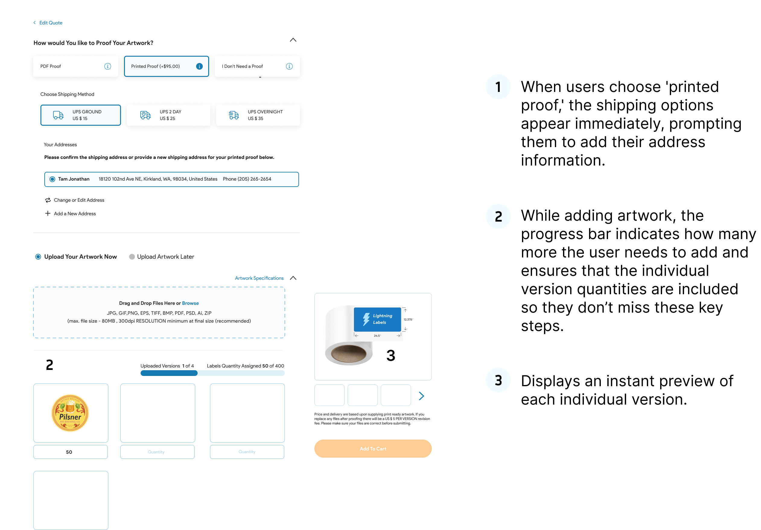
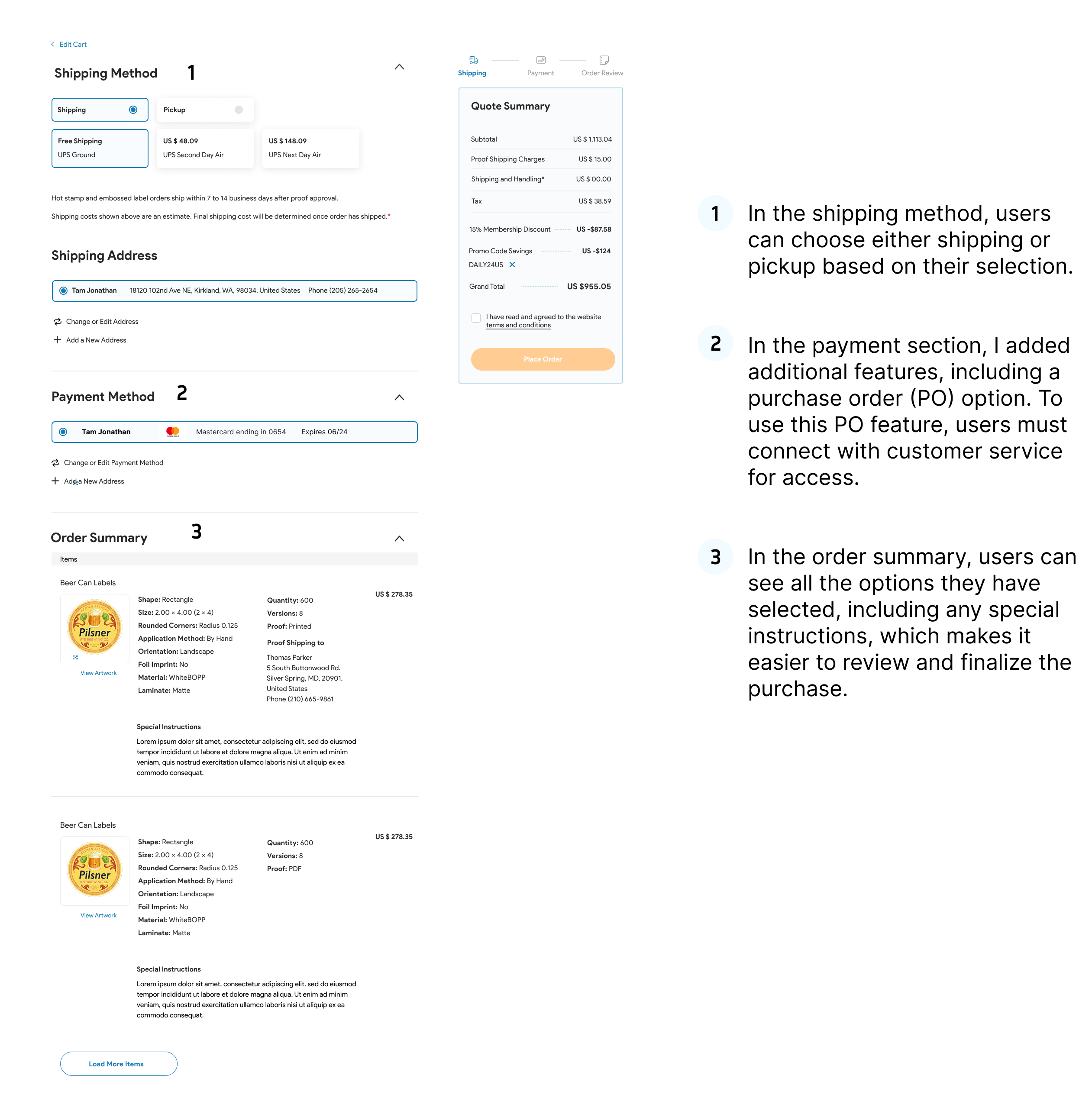
6. Flexible Checkout Options
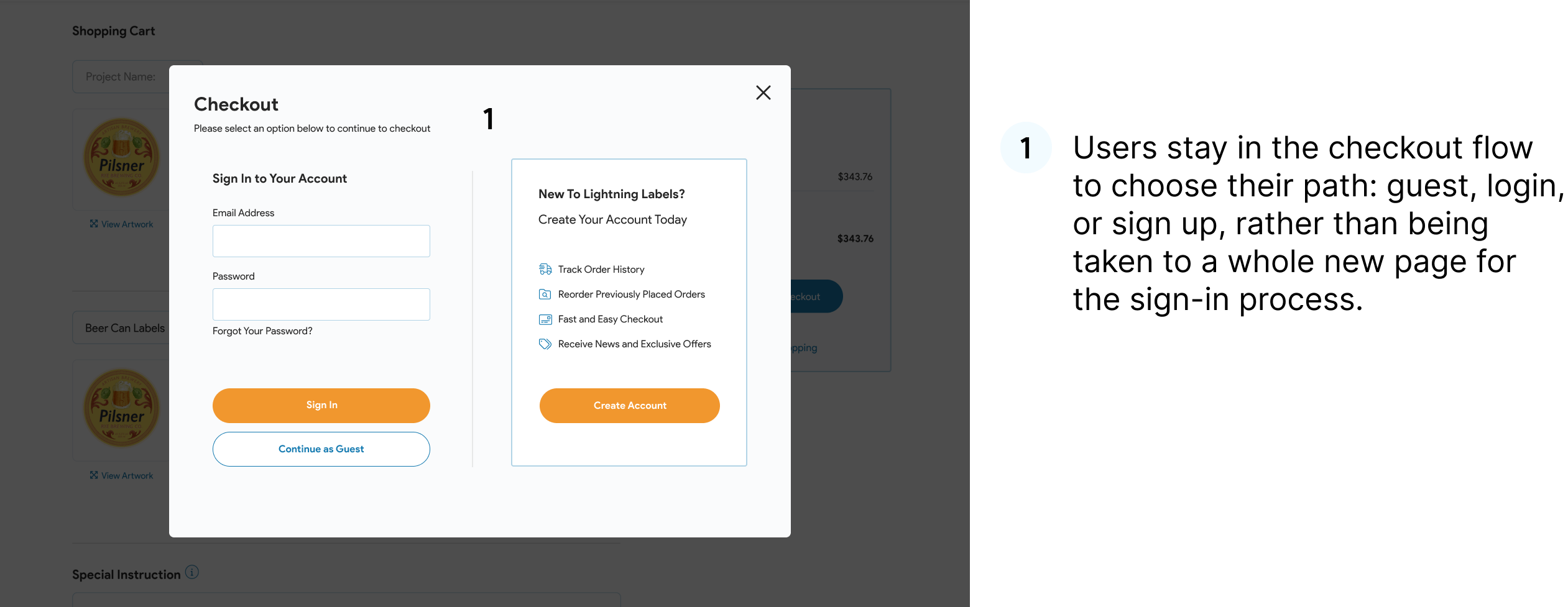
- Allowed users to stay in flow while choosing guest, login, or sign-up
- Dynamically revealed fields (e.g., shipping after selecting proof option)
- Added multiple payment options, including PO (with access control)
Outcome
The redesigned checkout experience is now:
- More streamlined and user-friendly
- Easier to navigate with fewer steps
- More transparent with better feedback
- Optimized for both new and returning users
Final Reflection
This project was about balancing complexity with clarity. By reducing steps and guiding users with the right information at the right time, I created a checkout experience that feels simple even for a complex product configuration flow.