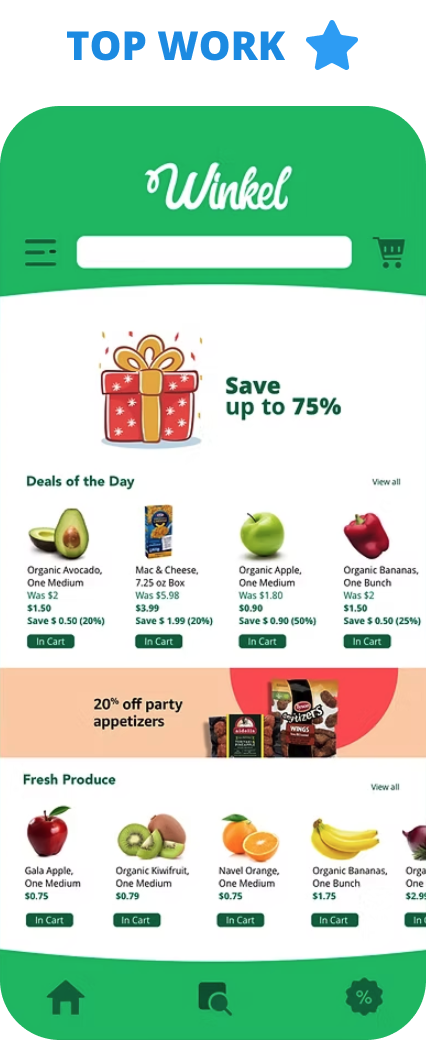
All Work > UX Case Study
Mobile Grocery Shopping App
Mobile First Experience
Duration:
6 weeks
Deliverables
Mobile Paper Prototype, Mood boards, Style tiles, Wireframes, High-fidelity mockups & High-fidelity prototype.
Tools
Sketch, Photoshop, Illustrator & InVision
The Challenge
Online grocery shopping doesn’t always cater to people with allergies, dietary needs, or vegan lifestyles. The options that do exist are often too expensive.
The process
1 Research
2 Synthesizing research & design strategy
3 Layout design
4 Wireframing & prototyping
5 Usability testing
Domain Research & Competitive Analysis
Click here: Competitive Analysis: Winkel

I found out Amazon Fresh, Instacart & Shipt are the main competitors and their strengths are listed below:
- Easy one-hour delivery.
- Attractive shopping incentives
- Highest quality, healthy and sustainable products
- Reasonable product costs
For this project, I made a user interview guide, collected three interview transcripts, and started Affinity Mapping.
Affinity Mapping

After the interviews, I noted down the user preferences and problems collected from my interviewees onto post-it notes, then I grouped these notes in an affinity map, that helped me to identify recurring issues and themes.
The following are the points that the users want:
• More vegan products and a wider range of produce options
• Low-cost products
• Offering more discounts and coupons
• Options in organic produce
• Highest quality, healthy produce
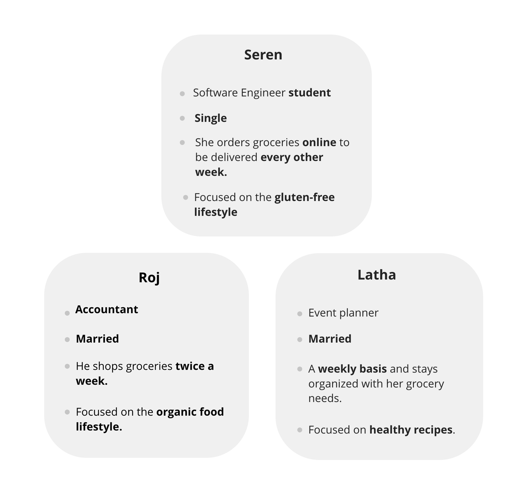
Persona
From the insights obtained from the affinity map, I was able to create a persona ‘Mathew’, also the user flow which required me to update the sitemap.

About Mathew
Mathew is a food photographer and blogger and he travels a lot. He loves to try to cook different country recipes. He has a busy schedule and he makes sure he is getting groceries at the correct time on a weekly basis
Problem statement
Busy professionals need to optimize their budget and healthy food options so that they feel satisfied with their purchases and they can spend their time doing things that really matter to them.
Application Map

An application map is to understand how a user interacts with the app and completes the regular task in an easy way.
Paper wireframe
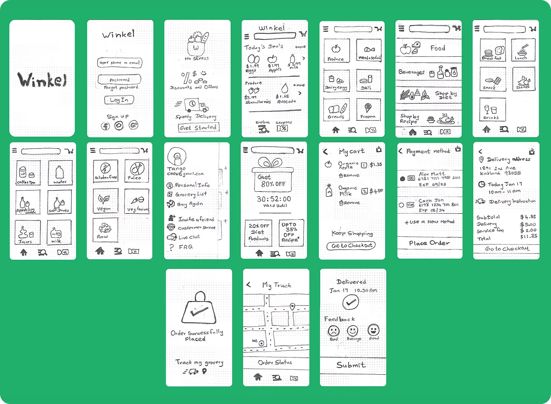
I sketched low-fidelity wireframes on paper to quickly explore ideas before moving into high-fidelity designs
Including
- Sign in page
- App onboarding
- Home Screen
- Sub Category screens
- Side navigation
- Offer page
- Payment page
- Tracking grocery screen
- Delivered page.
Mid-Wireframes
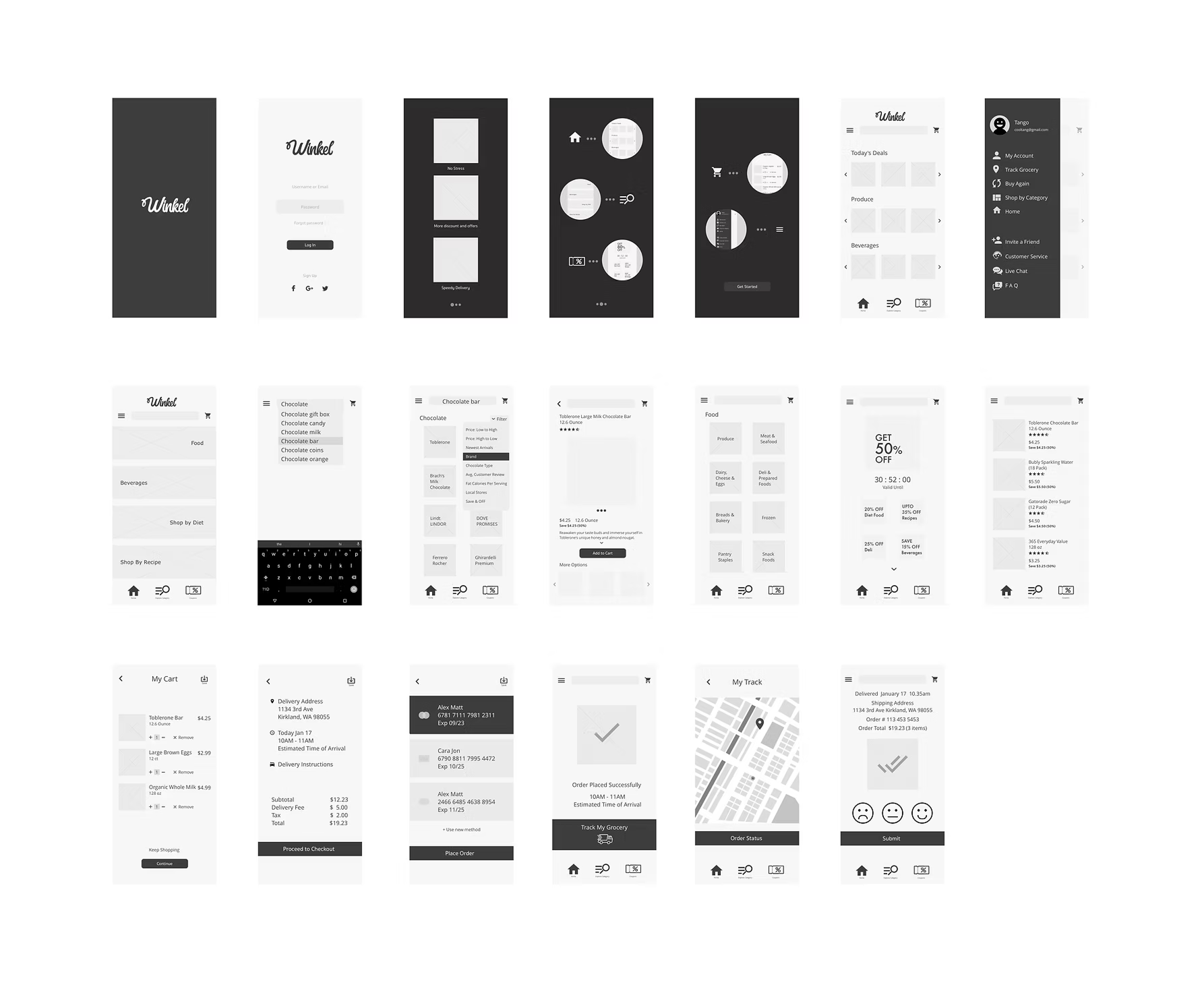
Using previous sketches, I created a new series of detailed mid-fidelity wireframes using the software Sketch that demonstrates a series of complete flows. Took inspiration from competitors both in and out of the domain.
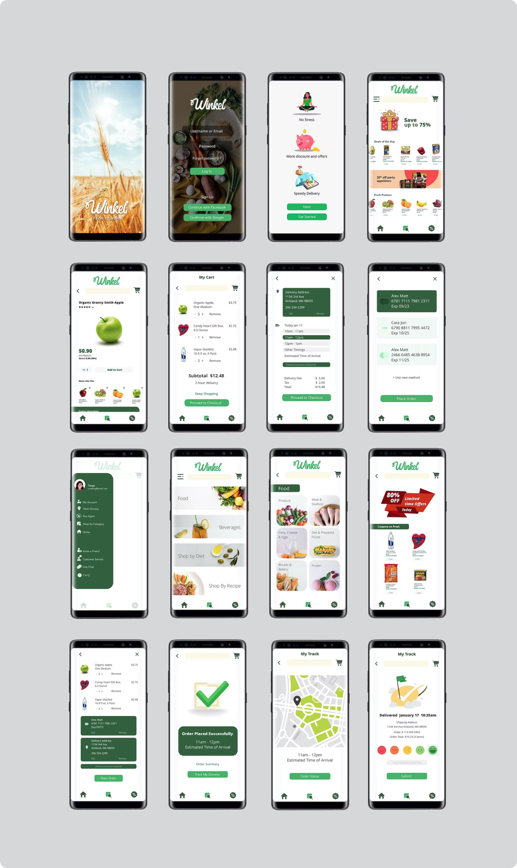
Prototype
From the wireframes, I create a clickable prototype to show a first-time user flow that goes through your app and solves the problem identified with the problem statement.
Mood board
I tried 2 visual inspirations for the Wikel app including typography, color, UI layouts, symbols, icons, photography, and anything else that brings the style I needed for.
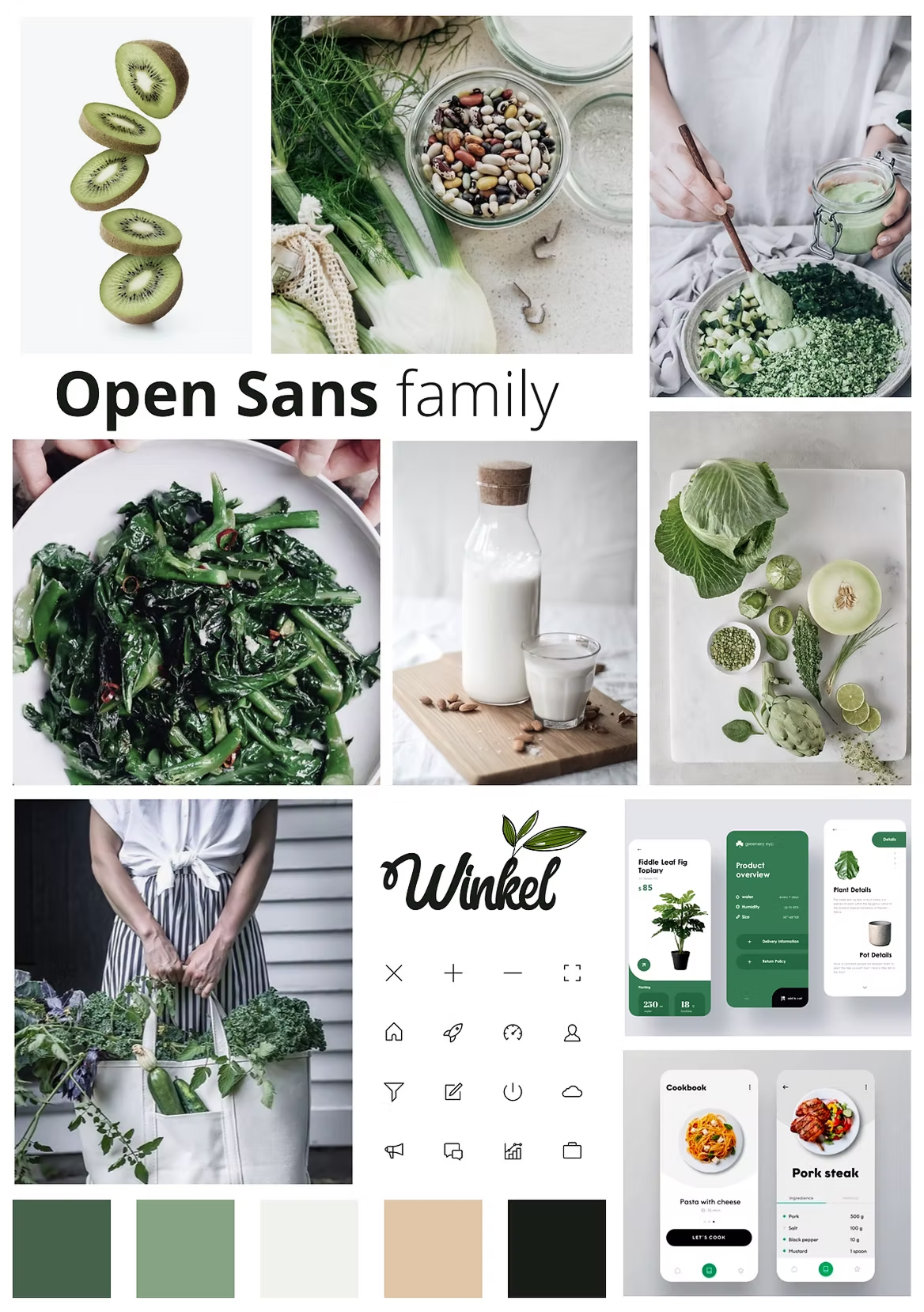
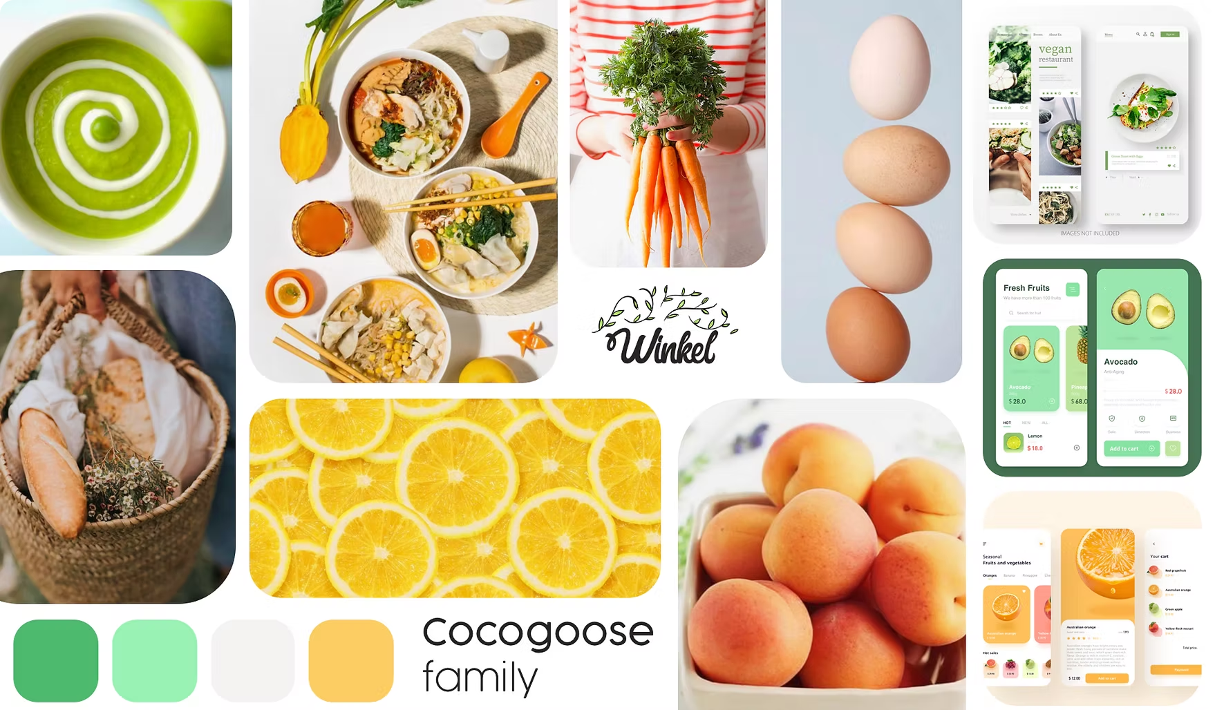
Through guerrilla testing, I refined the visual direction and selected a fun and fresh style using lime green for freshness and soft orange for energy, along with the Cocogoose font for clear readability.
Style Tiles
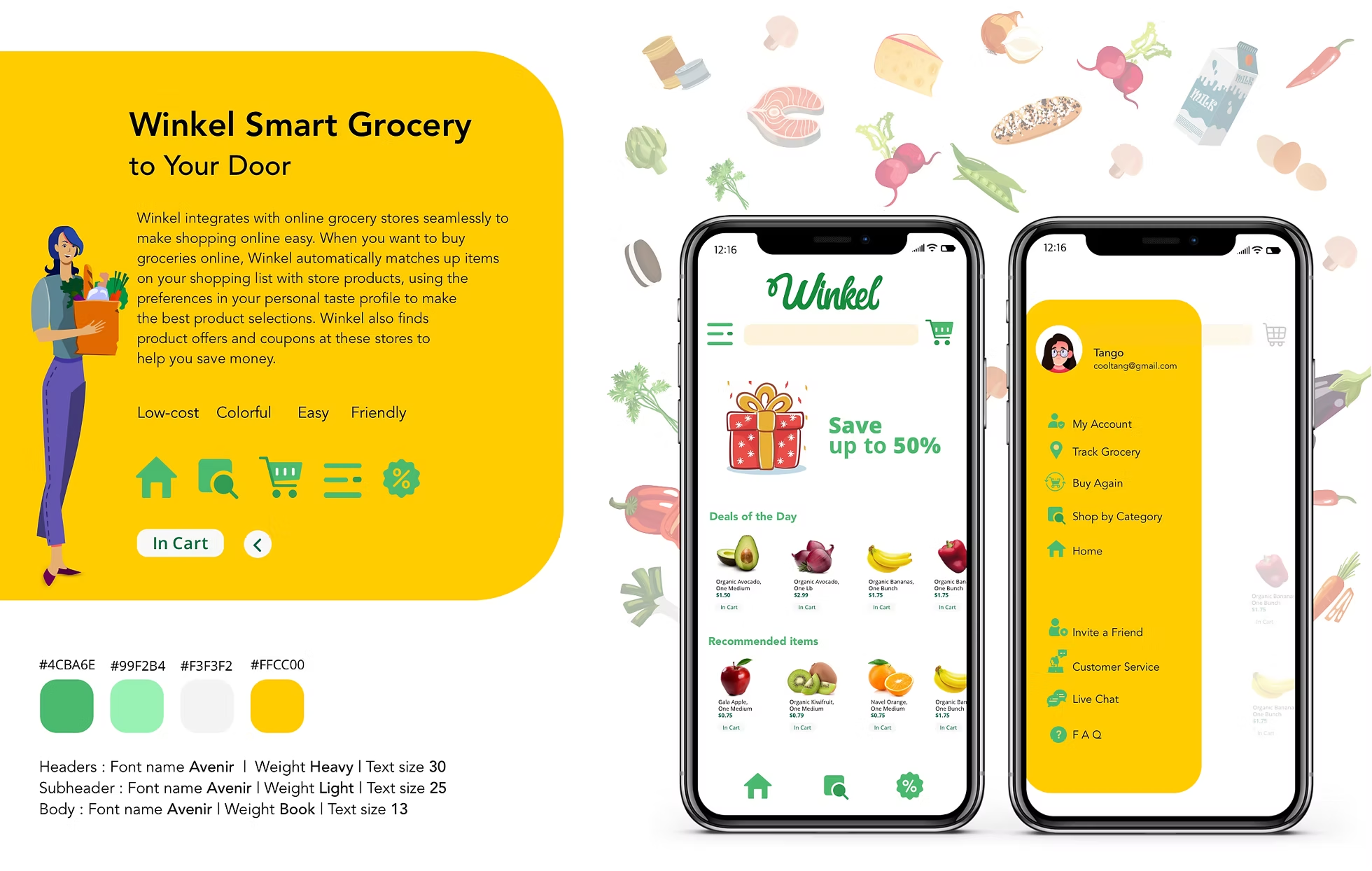
Used style tiles to explore and refine the visual design direction.
High-Fidelity Mockups
After multiple reviews, I worked on the following:
- Changed font size
- Changed CTA button color and name
- Changed Feedback options
- Modified Edit card option
- Made changes in produce quantity
- Darker black backgrounds Login for easy visible
- Changed New user screen tour
- Add product name on item page
High-fidelity prototype
Test plan
Conducted 3 individual interviews, all in-person, among consumers with different degrees of experience with the grocery app. This diversification of respondents was chosen to capture a broad range of consumer beliefs that predict intentions to buy groceries online or not. The sessions were 30 minutes in length, and I typically waited until the end of each session to answer questions. Records and notes were taken during the interview.
Interviewers
I gave 4 tasks for the users to complete to see whether it's understandable or not.
Results

Latha G mentioned that it was a hard time to find Shop by the recipe and Seren J mentioned that the signing page got stuck sometimes then worked fine. Raj V happy with Coupons page. All participants were able to complete task one within the expected time frame.
What I learned
This was an interesting project since every person on a regular day needs grocery and the fact of using an app for that purpose makes life easier. So it should be a user-friendly app. I checked everything carefully and if anything didn't make sense, I checked the wireframe and navigation. I tried again until the process made sense. In the end, I was super happy with the final product, and most importantly, it felt useful and usable.
Conclusion
There are many grocery apps out there but I wanted this app to be easily understandable for the users and at the same time, give an option for finding the product in multiple ways with a pleasant UI design thereby giving the results I expected during the user interviews.