All Work > UX Case Study
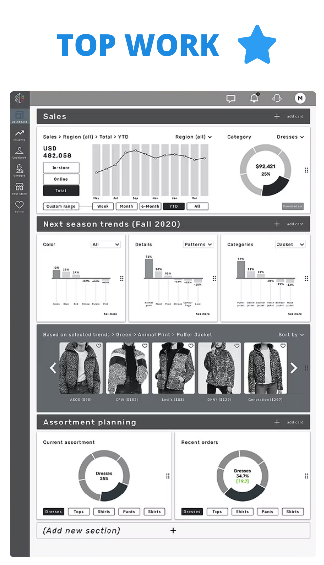
Apparel Industry Dashboard
Fashion & Apparel Analytics
Duration
4 weeks
Deliverables
Wireframes, Prototype
Tools
Sketch, Illustrator & InVision
My role
Research, Player flows, Sketching, Wire framing, Branding, Prototyping, User interviews, User interface design, Illustration
Neural Trend
A platform for the fashion apparel industry that uses artificial intelligence.
Overview
Neural Trend wanted support in making the platform's overall structure understandable and easy to navigate. The goal is to create a better user experience that allows time-crunched executives to quickly get the information they need.
Process
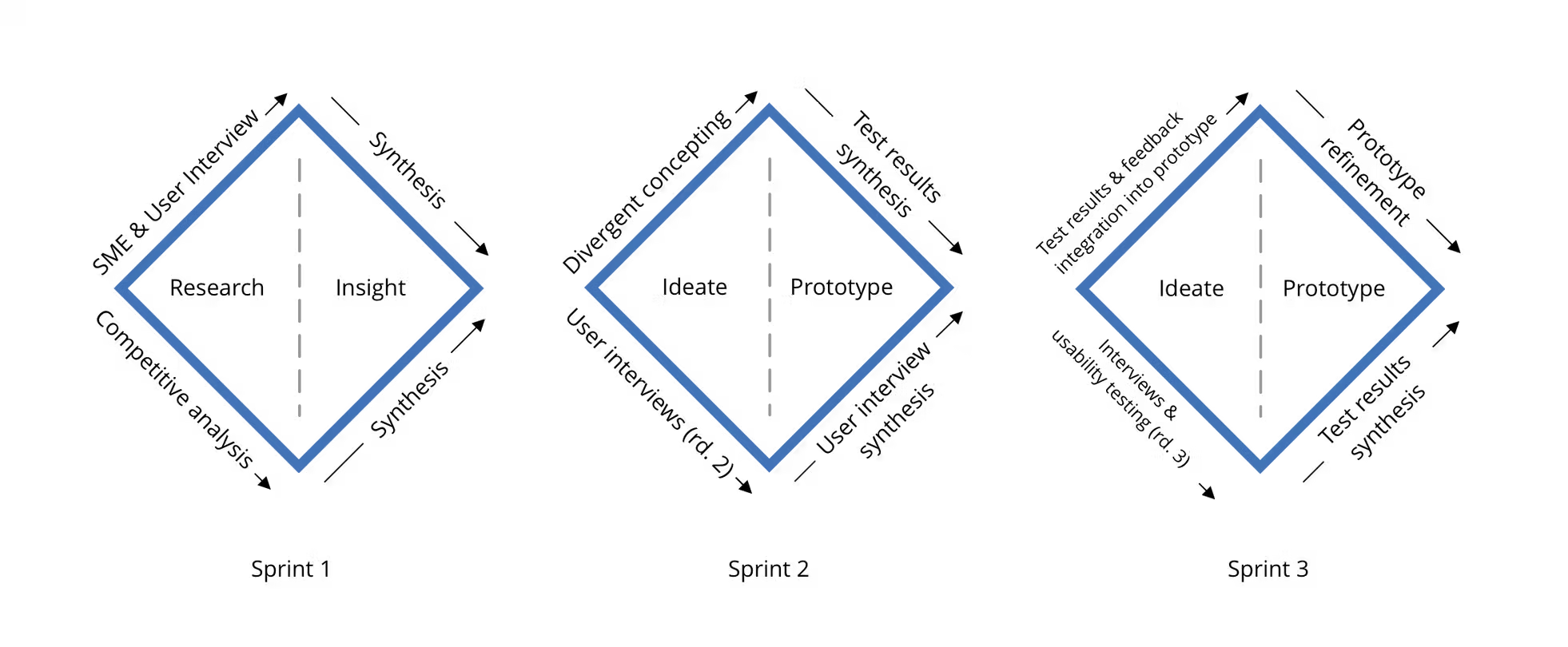
We used the process of Double Diamond with user & SME testings, did additional research thereby being able to create three divergent approaches and then combined it into one final prototype. We started with interviews conducted for NeuralTrend employees, merchandisers & vendors.
Interview (Round 1)
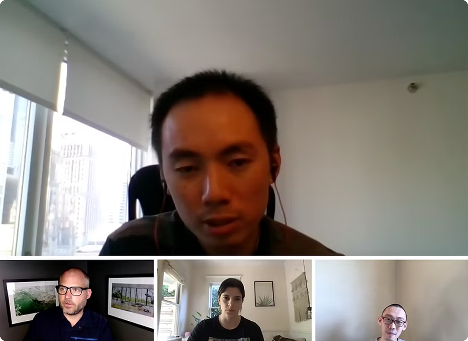
Totally for this 1st round, we interviewed 6 users and 4 SMEs. We got a lot of important insights from their responses added below.
Let’s start with some interesting quotes from our users.
“Our North Star user is definitely the retailer buyer and planner.”
- Andy, Product manager at Neural Trend
We grouped together and summarized our interview below:

We came to the conclusion that users need information organized in the following ways:
- Aligns naturally with their order of decision-making
- Makes data manipulation intuitive
- Reduces cognitive load
- Makes it easier to complete their tasks
- Lends confidence to decision-making
The following are the points that the users want:
- Reduced cognitive load
- Easier task completion
- Confidence in decision-making
With all this information, we moved forward with ‘Competitive analysis’ and also evaluating language and messaging, target audience, the platform features, design patterns, information organization & customization.
Competitive analysis

Competitive analysis was a bit tricky for us because all the brands were highly confidential and it was only available for their real clients so we started searching from every possible availability, even screenshots helped us to understand what's unique with each brand.
Finally, we found out our competitors’ main strengths
- Customer can choose to sign up to all solutions (all services they provide) or individual services
- Data from image and text recognition
- Promotional planning
- Offers training and advice, unlimited
The weakness of each brand:

With all the users’ feedback and competitors’ information, we started to do the wireframe individually, and finally, we came up with 5 different approaches.
Wireframes
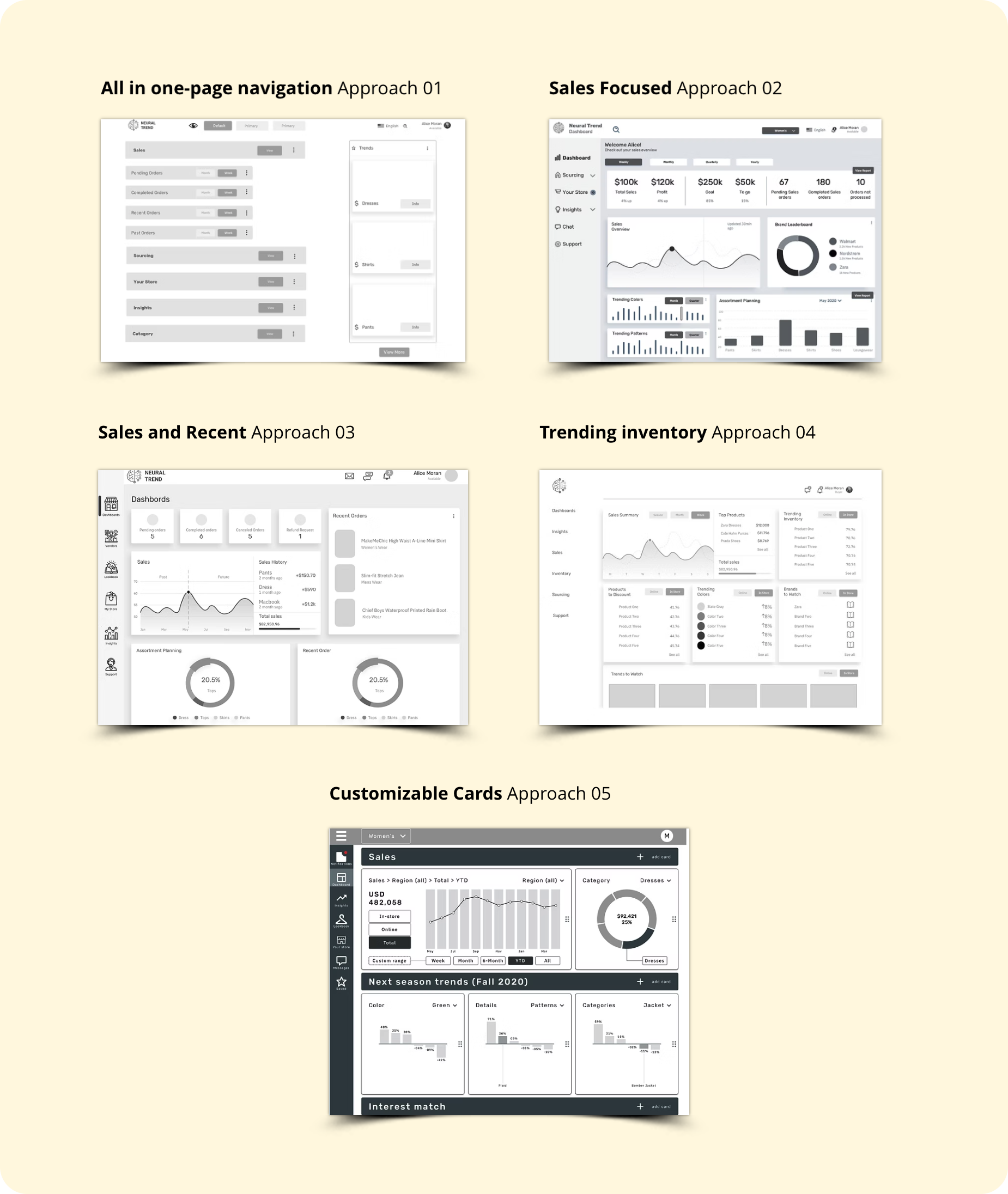
We had a time crunch since we had only one day to create the individual wireframe. Then on the 2nd day, we need to decide which three wireframes are to be chosen out of five wireframes.
We selected Approach 02 for the fact that it has easy navigation with different options, Approach 04 for understandable inventory insights & Approach 05 for the informative dashboard and movable cards.
That’s one of the long discussions we had as a group. Then we took important and useful features from other wireframes and we came up with three new hybrid wireframes in order to prototype.
With the final three prototypes, we started our second round interviews
Interview (Round 2)
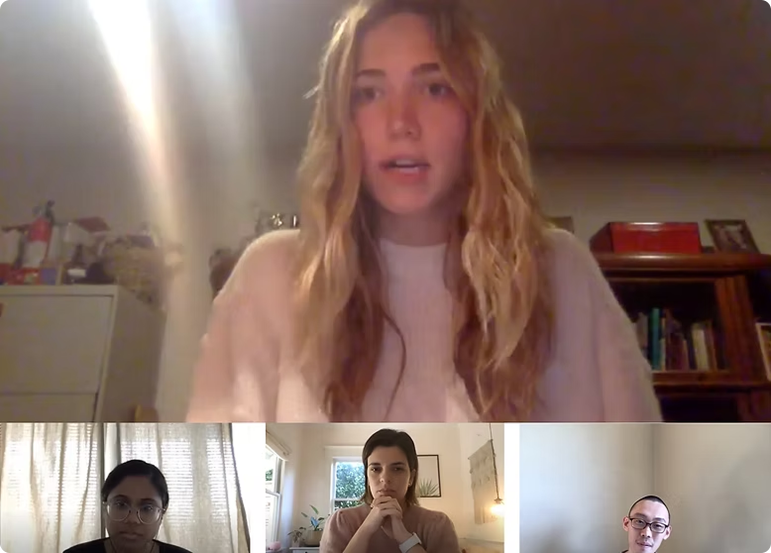
We then conducted five concept tests and two additional user interviews.
Affinity diagram
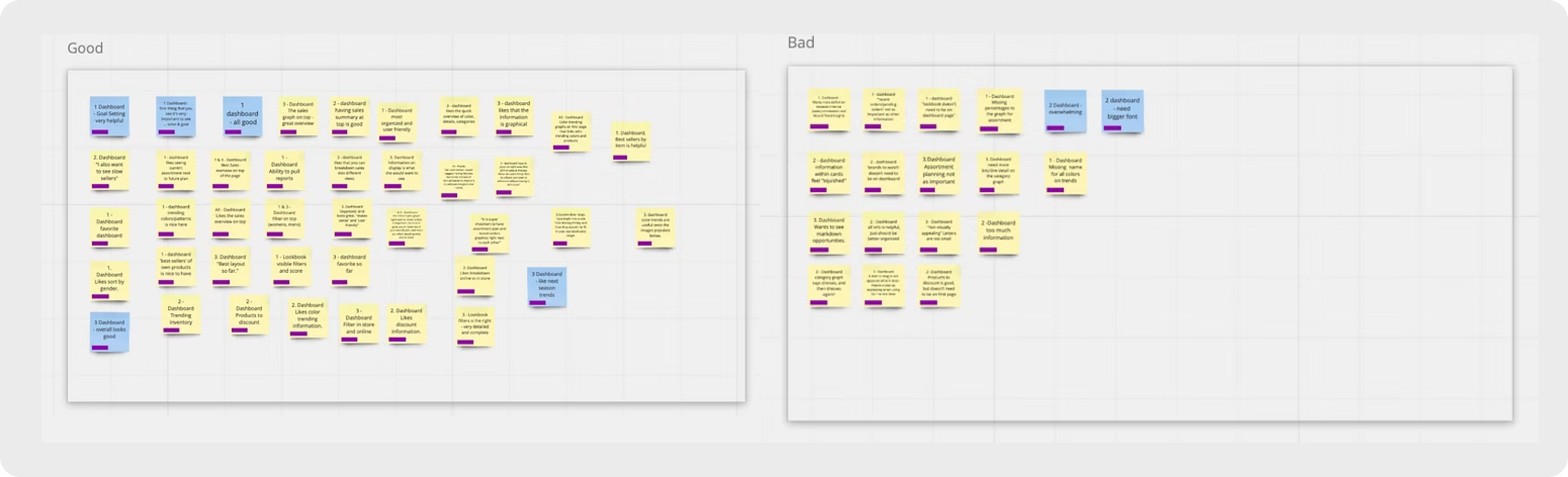
After that, we worked on the affinity diagram using the closed sorting system. Altogether, we synthesized the categories and created the final report.
Concept testing - Key takeaways

Dashboard solutions
- Sales information at the top of the dashboard, understandable by testers
- Users requested for customizability
LookBook Solutions
- Adding product scores on lookbook.
- Adding filters on the top.
Insights Solutions
- Adding Map view is easy to see consumer trends
- Able to customize option
Global
- Ability to pull a report
- Ability to share custom views of items on the platform as PDF
- Add Moodboards
Suggestions
- Add Section of Brands to watch
- Trending Patterns/Colors/Material
- More focus to detail on Assortment Planning
- Color and Pattern Picker
- Custom Time Reference Day/Week/Month/Quarter
With all the above suggestions and information, we move forward with the Final mid-fidelity wireframes
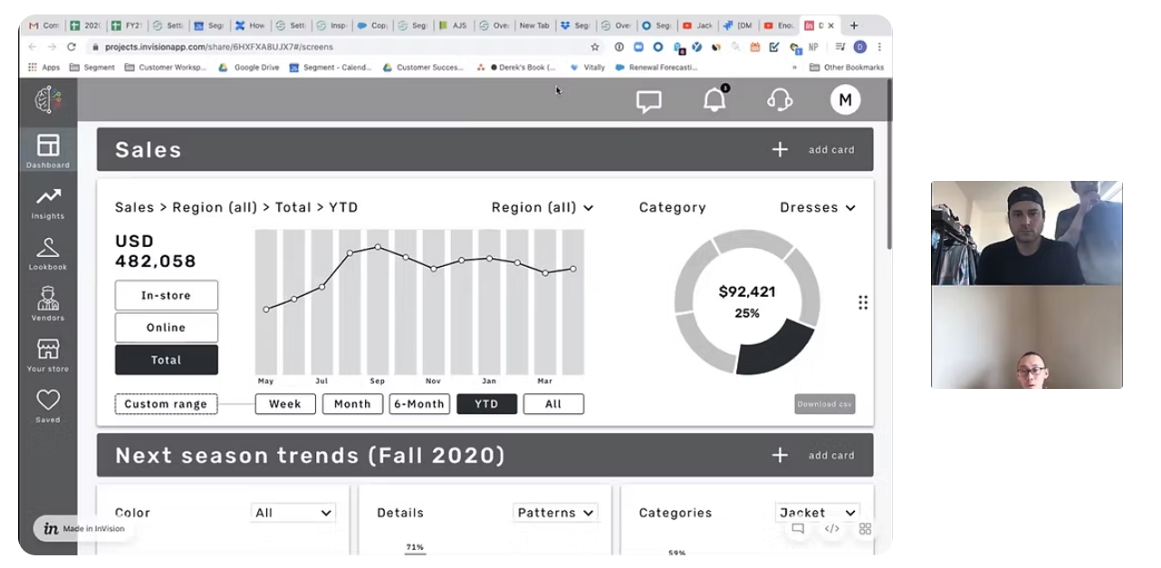
Final mid-fidelity wireframes


Final Prototype
Usability test interview (Round 3)
In total, we conducted 6 user interviews. Since it was a long weekend, we had trouble scheduling user interviews. It literally was our panic moment because, within the next 2 days, we need to hand over the project to the clients. Within one day, as a team, we completed all the user interviews successfully and we gave 5 tasks for the users to complete to see whether it's understandable or not.
Listed below are the key takeaways.
Quantitative results
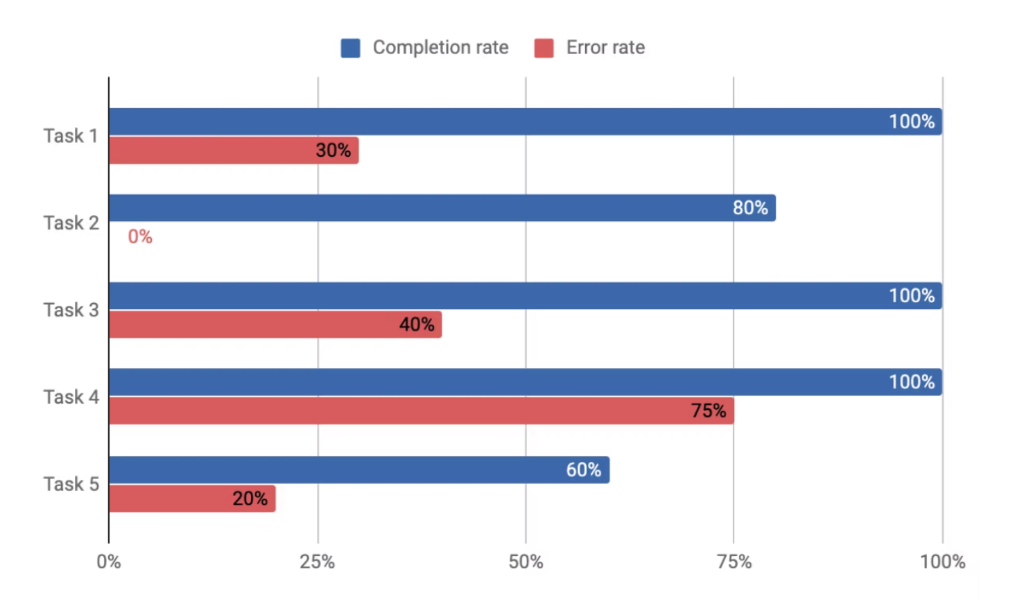
Quantitative results
- Often heard ‘Easy’ after the completion of tasks.
- Users who struggled with a task still rated highly and mentioned ‘the steps were easy’
- Users navigated the product differently and got to the same result.
- Some users reported confusion over site terminology.
- Make interactions even more obvious where possible.
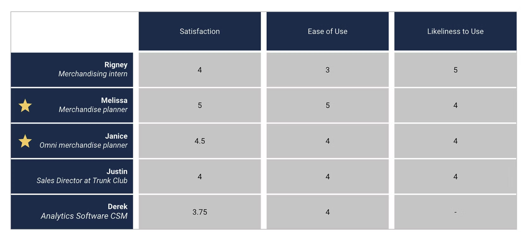
Quotes from usability testing
“Everything was clear, easy to navigate, good user experience“
- Janice (Buyer for Ann Taylor), in reference to overall product satisfaction
“Feels familiar... and good for a user who is not tech-savvy”
- Melissa (Buyer/Vendor), in reference to the entire product ease of use
What I learned
A few of the pointers that I learned from this activity is that the more interviews are conducted, the more insights we receive for the brief. The Filter option seems to be universal and is always understandable on multifarious platforms. Product score is the most significant factor for the fashion apparel industry.
What I may do differently
Within the 4 week duration, we tried the best way to solve the problem and come up with the right decision and client needs. I believe we did whatever we could in the given timeframe and efficiently handled this project. As learning from this project, we need to focus on getting more user interviews which would eventually help in yielding better results.
Conclusion
We added new features such as top filters, easily understandable graphs, a better-structured dashboard, lookbook, and insight section. Our final product was appreciated by our users and they feel it's much easier and better streamlined. This thereby shows that we achieved the goal and we created a better user experience on the platform which makes it easy for a time-crunched executive to quickly get the information they need.