All Work > UX Case Study
Retail Label Site & Checkout Revamp
Site-Wide and Checkout Flow Improvements
Duration
4 weeks
Deliverables
Research, User flow, Wire framing, Prototype and QA.
Tools
Figma
Overview
In this project, I redesigned the homepage, top navigation, and checkout experience for In Stock Labels to improve usability, streamline user flow, and increase conversions.
The goal was to create a frictionless journey, from product discovery to purchase by focusing on clarity, speed, and intuitive interactions.
Problem Statement
The existing experience created friction during key conversion moments. Users faced:
- Confusing navigation and product discovery
- A checkout flow that required unnecessary effort
- Lack of transparency (e.g., shipping shown too late)
- Inefficient experience for guest users
This led to drop-offs during checkout and a less engaging browsing experience.
The process
Research > Define & Ideate > Information Architecture (IA) > Wireframing > Move to development > QA
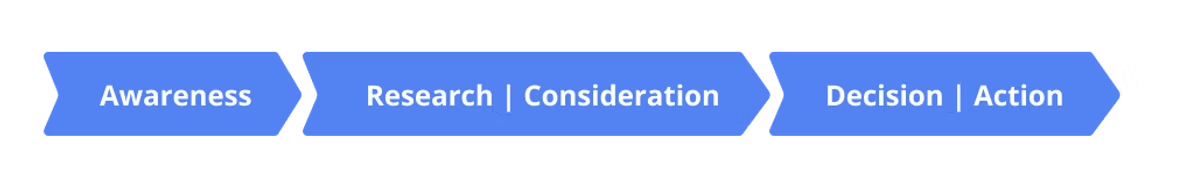
Stage in Customer Journey
What do we want the user to do next and how do we nudge them to take action.
Goals
- Improve product discoverability through better navigation
- Simplify the checkout process for both guest and returning users
- Reduce friction and cognitive load
- Increase conversion rates
- Create a consistent and scalable design system
Homepage Design Upgrade
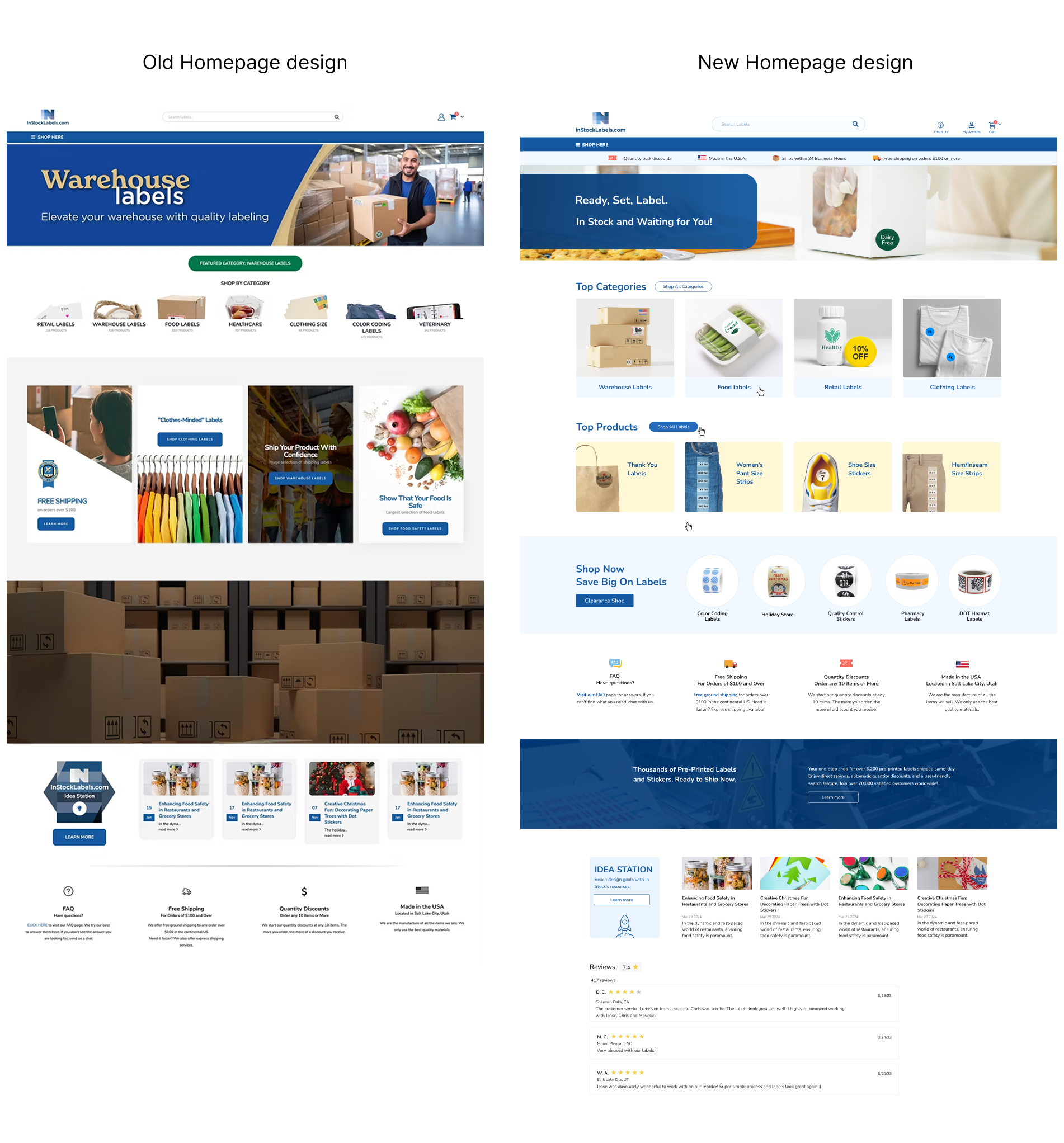
Homepage Redesign
Improvements:
- Stronger visual hierarchy
- Cleaner layout (removed heavy visual elements)
- Better content scanning
- Clear CTAs guiding users to products
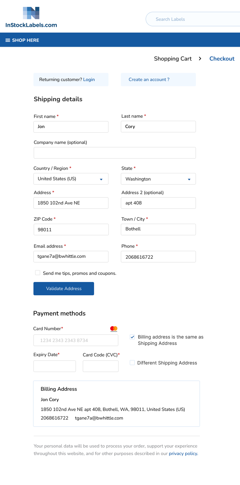
Checkout Redesign
Challenge
The checkout process was complex and confusing, causing users to drop off before completing their purchase.
Improvements
- Simplified the flow into clear, step-by-step stages
- Reduced unnecessary form fields
- Displayed shipping costs earlier for transparency
- Optimized experience for both guest and returning users


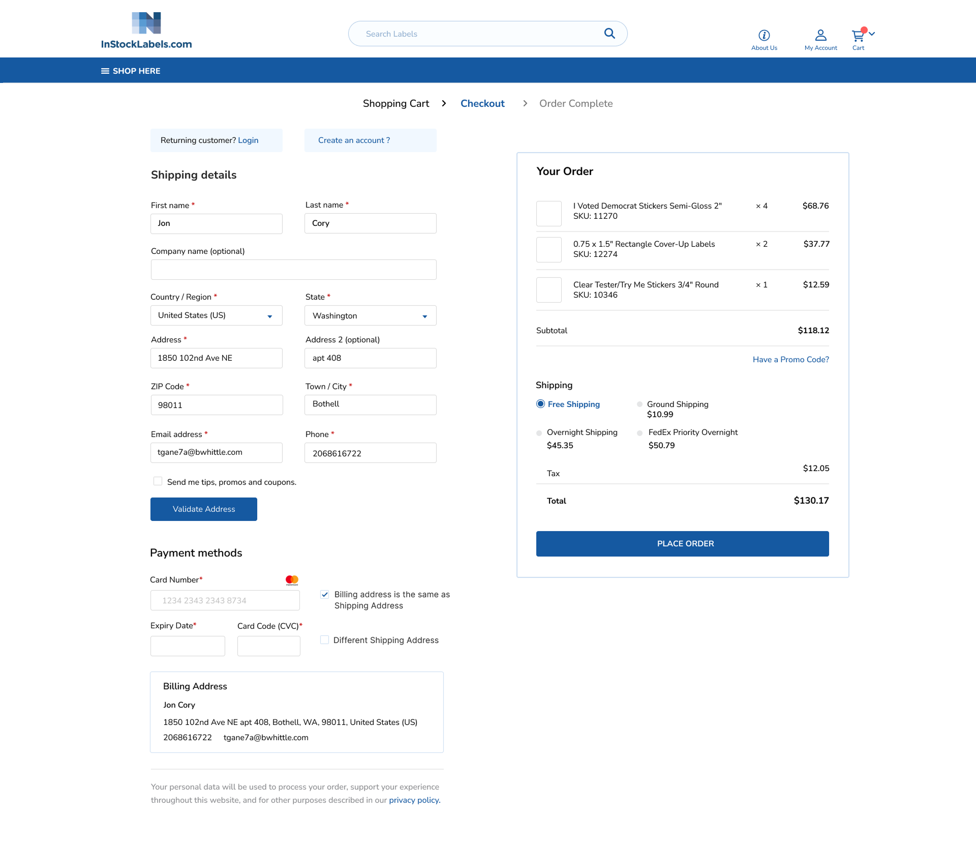
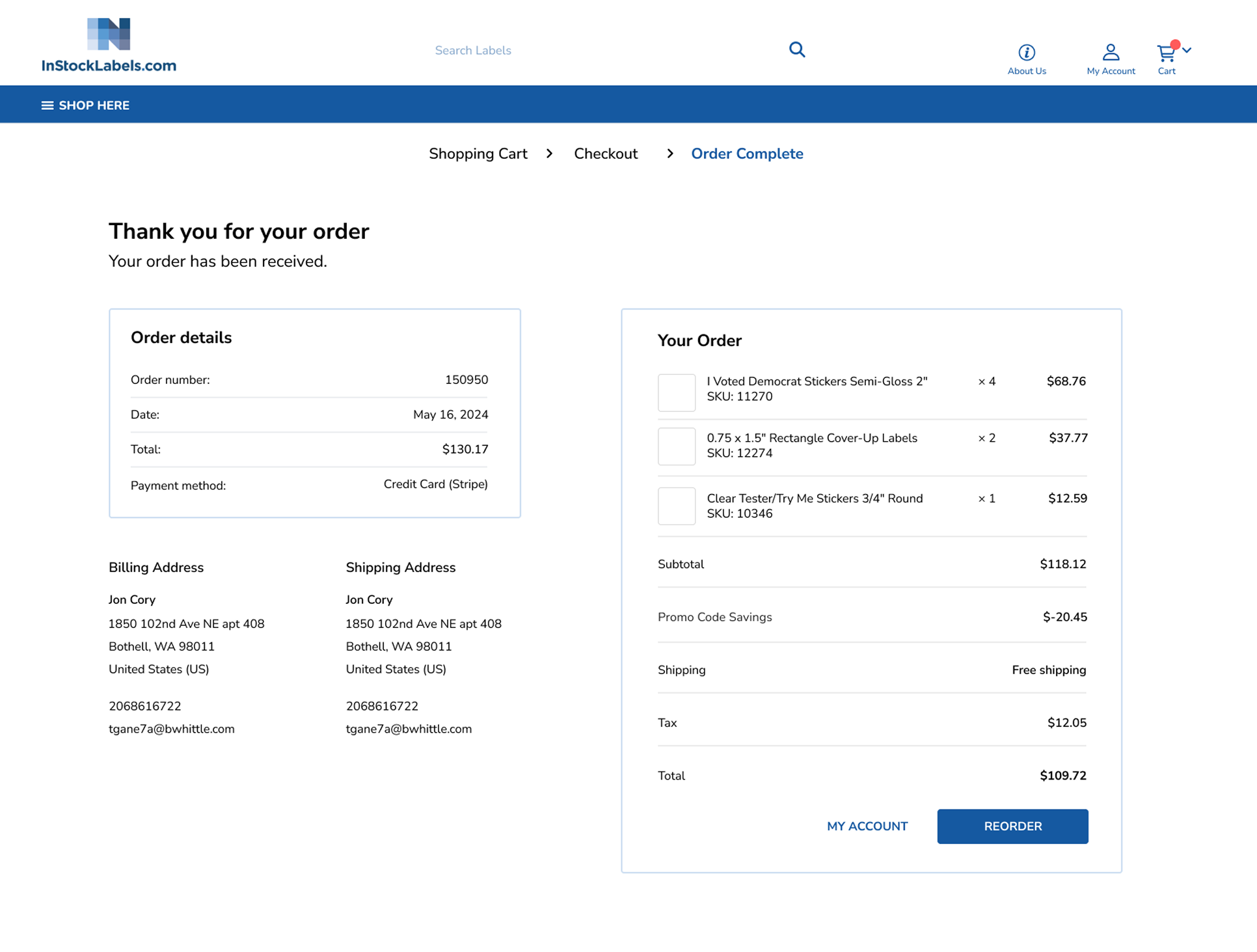
The checkout flow was redesigned to reduce drop-offs by simplifying steps, improving transparency, and optimizing for speed. Key improvements included early shipping visibility, fewer form fields, and a smoother experience for guest users.
Final Reflection
This project reinforced the importance of balancing ideal UX with real-world constraints.
Even when technical limitations required adjustments, I ensured the experience remained:
- Clear
- Accessible
- Efficient
The final solution successfully improved usability while working within existing system limitations.