All Work > UX Case Study
Industrial Label User Dashboard
Redesigned the experienc
Duration
3 weeks
Deliverables
Research, User Flows, Wireframes
Tools
Figma
Overview
In this project, I redesigned the user account experience for a confidential brand by focusing on usability, clarity, and efficiency. The goal was to address existing user pain points and create a smoother, more intuitive flow across the platform.
I designed the experience to be fully responsive, ensuring it works seamlessly across desktop, tablet, and mobile devices.
My Approach
I started by analyzing the existing experience and identifying key friction points in navigation, order management, and account interactions. From there, I restructured the experience to make it more user-friendly, efficient, and scalable.
Key Improvements
1. Simplified Navigation & Dashboard Structure
.avif)
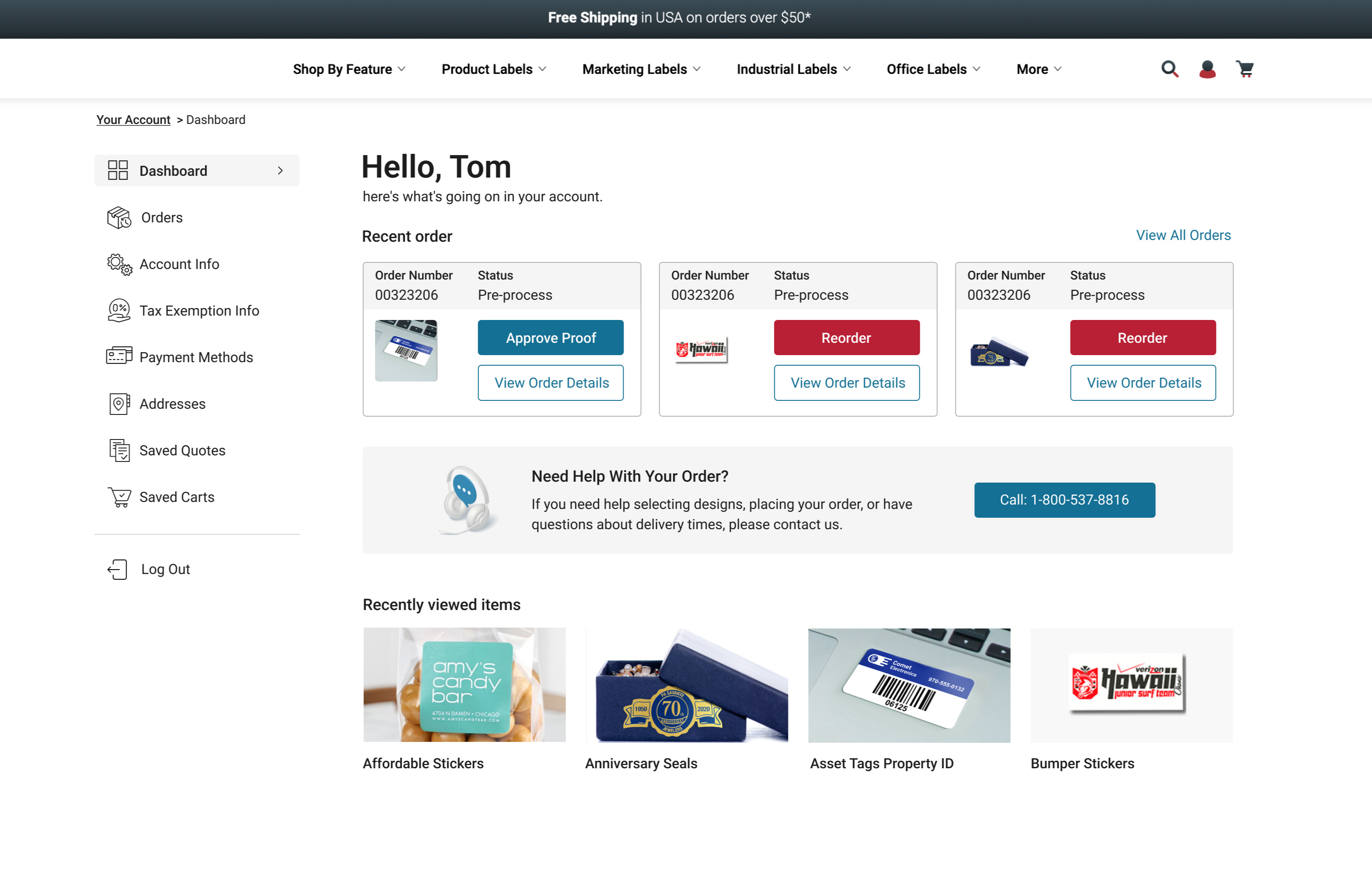
I introduced a sidebar navigation system to help users quickly access different sections without needing to return to the main account page. This makes it easier to switch between categories and find key information faster.
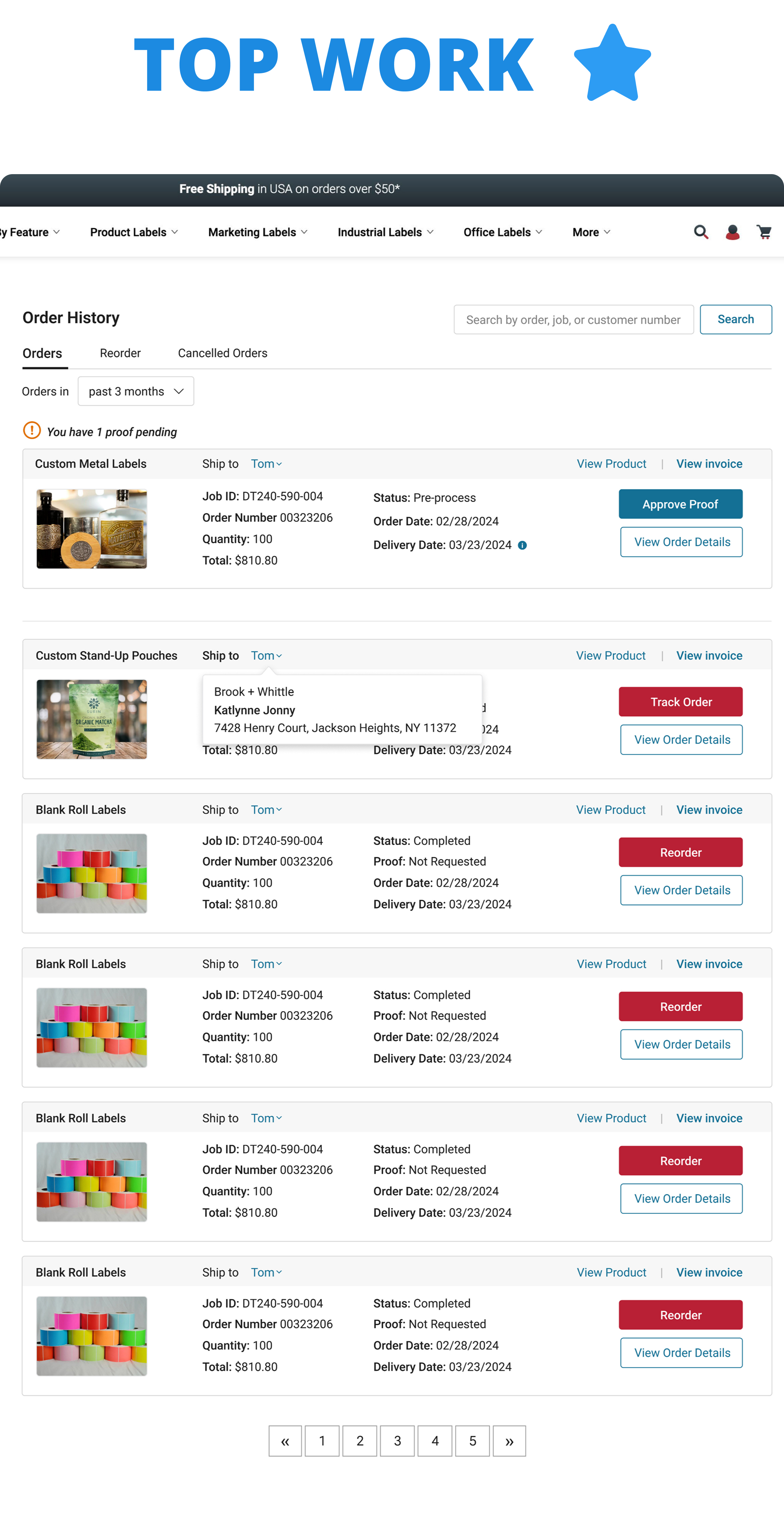
2. Improved Order Visibility & Reordering

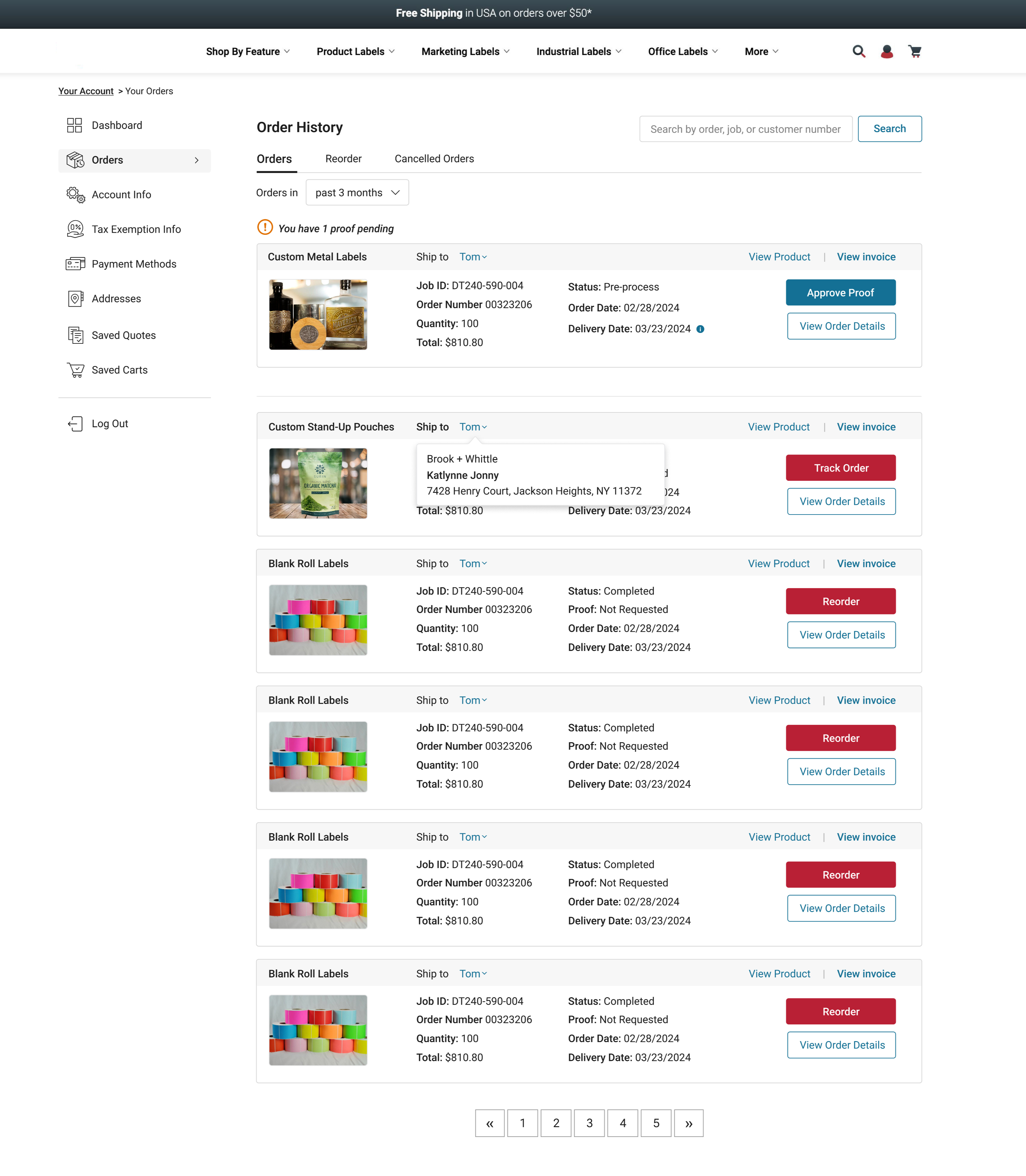
Previously, users had limited visibility into their orders. I redesigned this section so users can:
- View pending orders and next steps at a glance
- Access key details from previous purchases
- Reorder items with a single click
- Easily download invoices
This reduces friction and makes repeat purchases much faster.
3. Enhanced Document Upload Experience

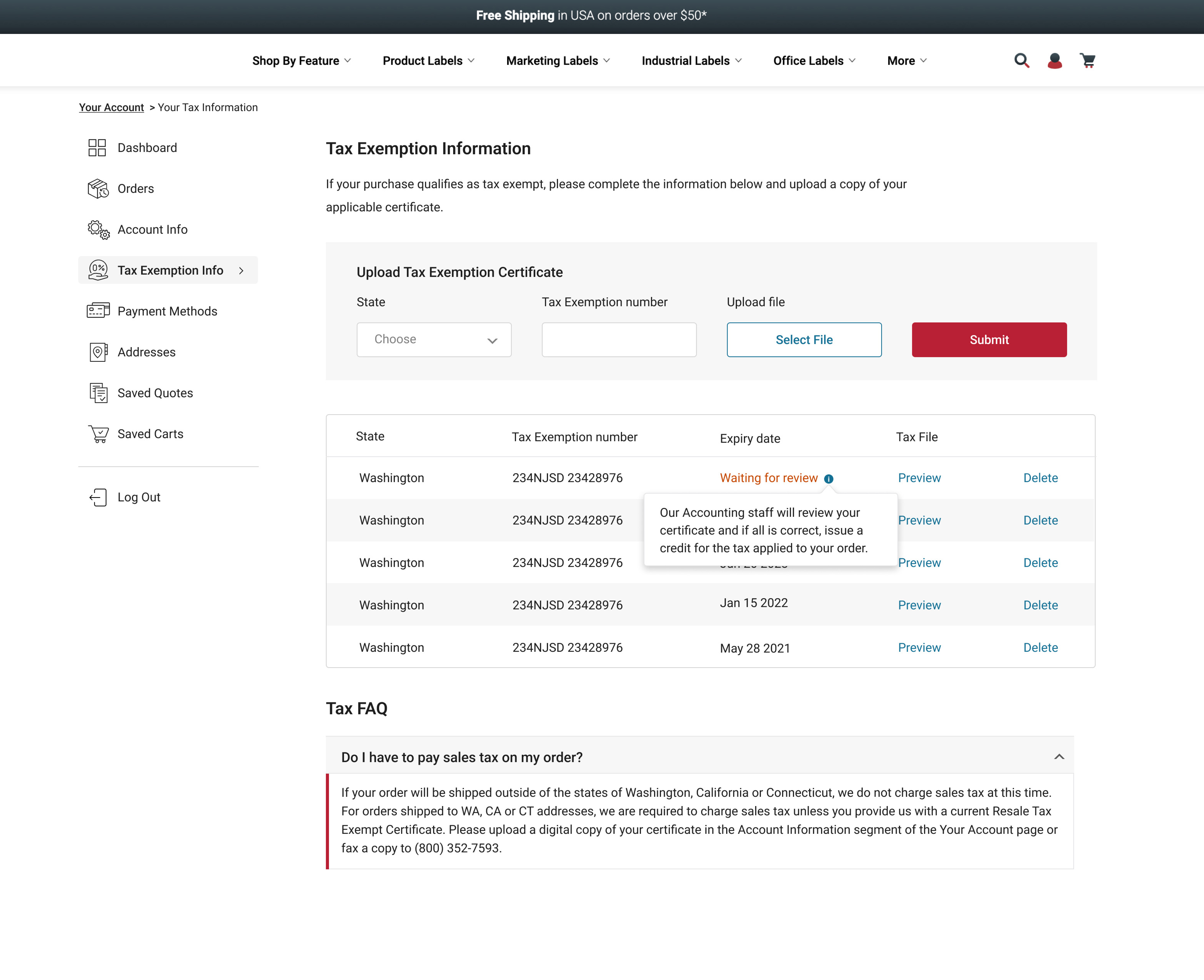
I made the upload feature more prominent and easier to use. Users can now:
- View all uploaded documents in one place
- See detailed information for each file
- Preview or delete documents
- Access a built-in FAQ for guidance
This improves clarity and reduces confusion during uploads.
4. Streamlined Address Management

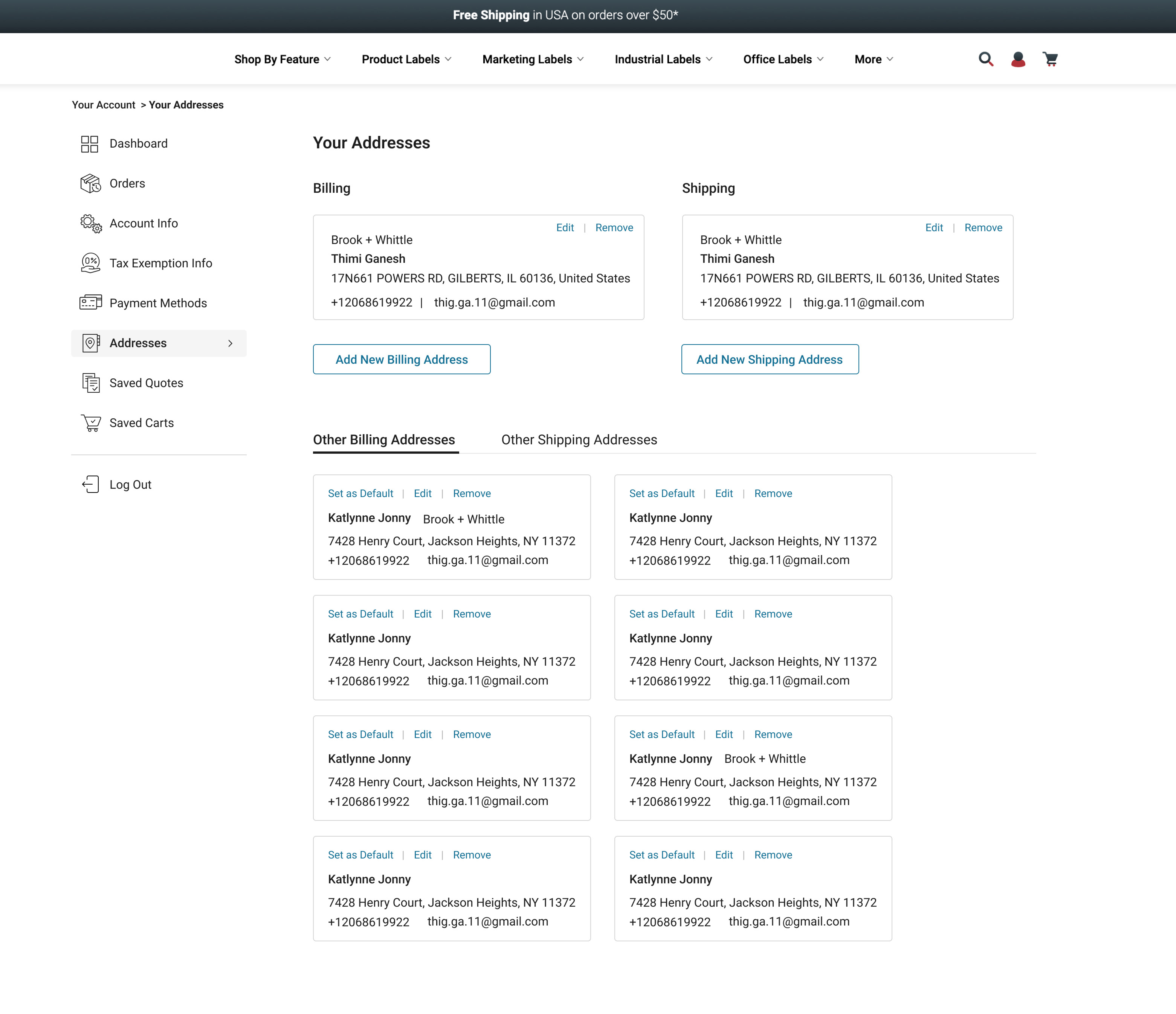
I reorganized the address section to make it more intuitive:
- Default shipping and billing addresses are shown at the top
- Additional addresses are separated into clear tabs
- Users can edit or set a default address with one click
This makes managing addresses quicker and more efficient.
5. Better Quote & Order Experience

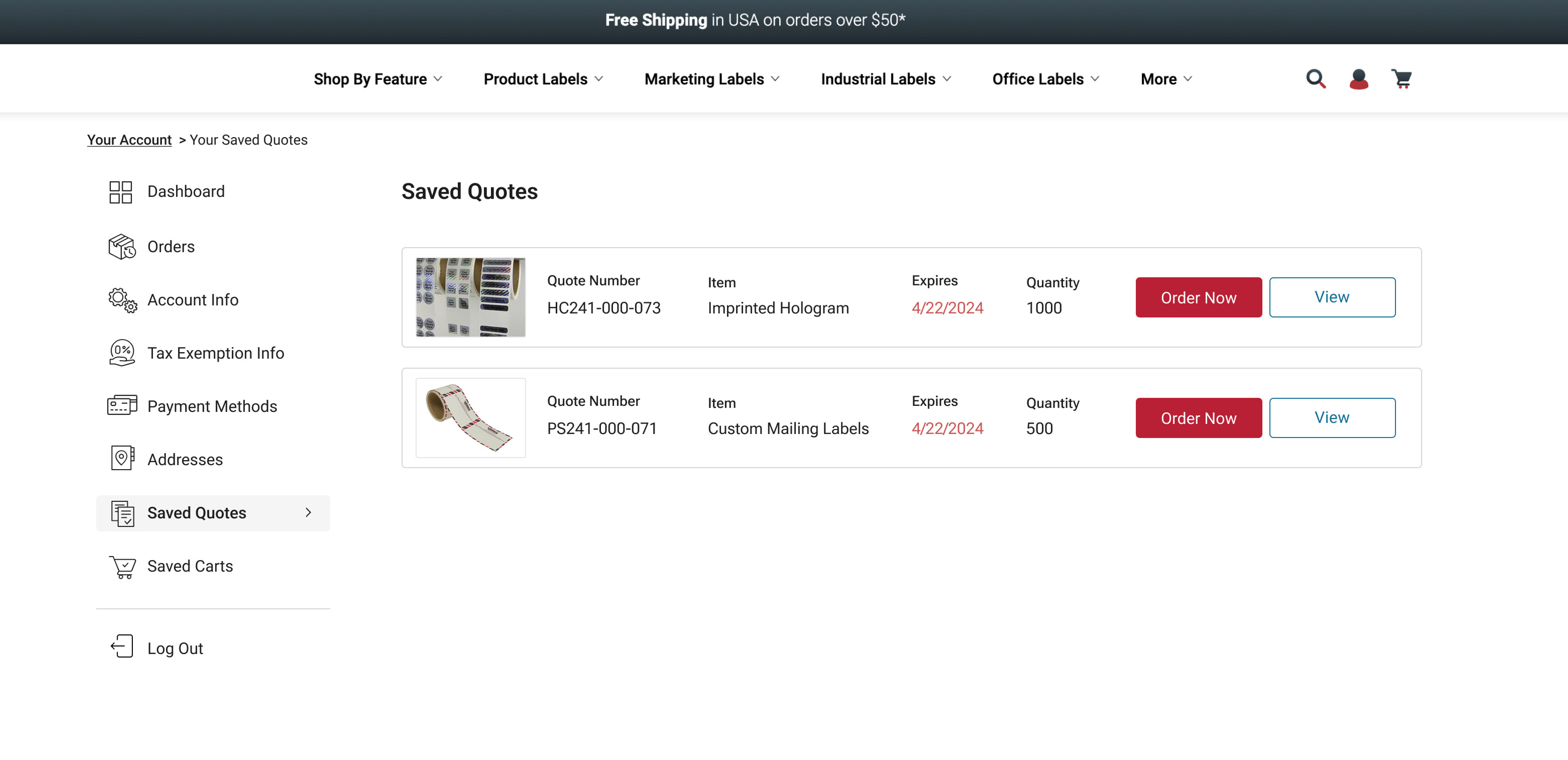
In the previous design, users had to click into each quote to see details. I improved this by:
- Showing key order details upfront
- Allowing quick actions directly from the list view
- Reducing unnecessary clicks
This helps users move through the ordering process faster.
6. Flexible Checkout Flow

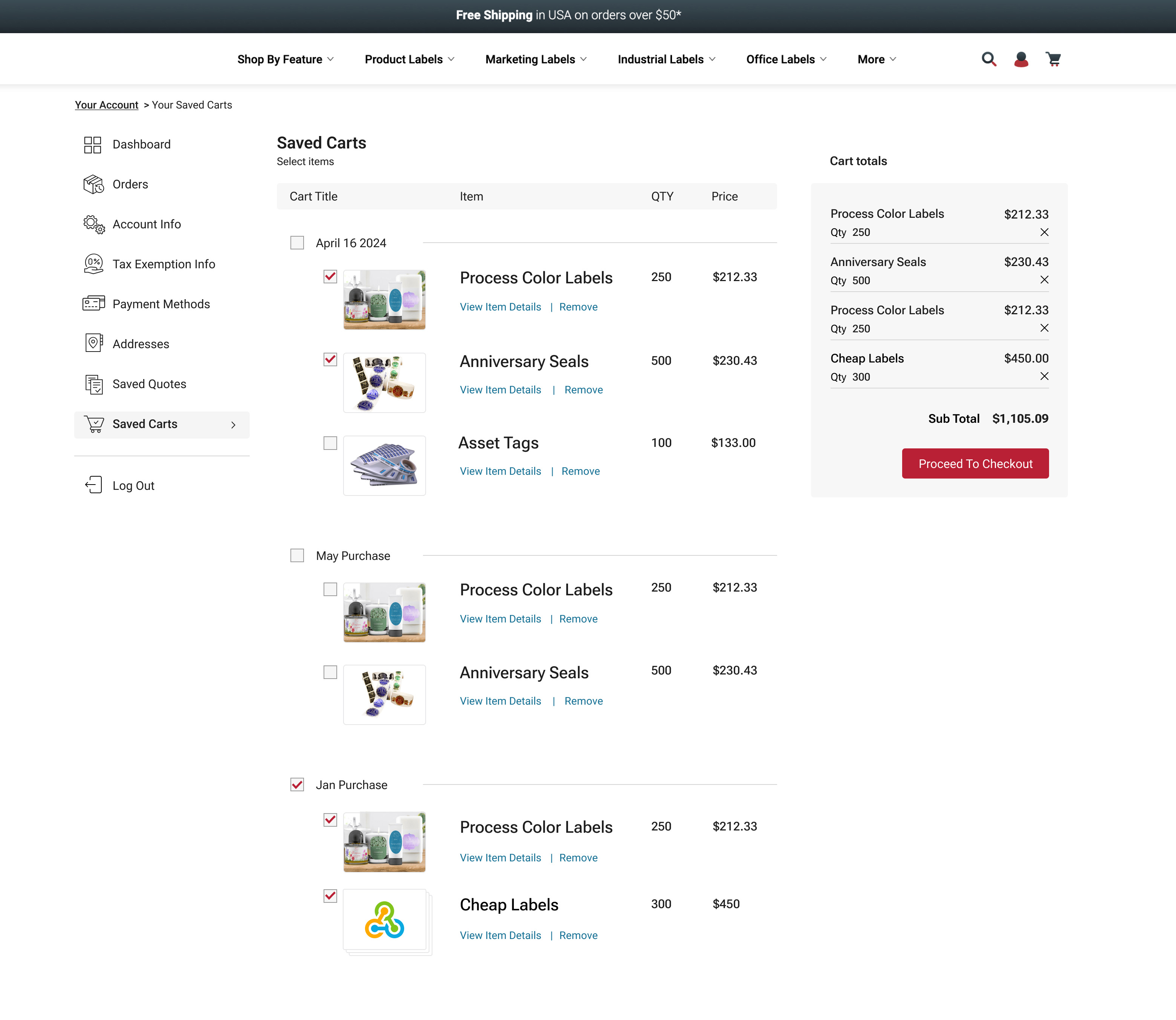
I redesigned the checkout experience to support more flexibility:
- Users can select entire quotes or individual products
- Product images improve recognition and usability
- A clear cart summary shows totals upfront
This creates a more transparent and user-friendly checkout process.
Outcome
Through this redesign, I created a more intuitive and efficient user account experience that reduces friction, improves visibility, and supports faster task completion. The new structure is scalable and aligns better with user expectations.